| « Background Image | Index | Collections » |
Check Boxes
To set up check boxes, set CheckBoxes property to either TwoState or ThreeState. You can disable check box on certain items by setting BetterListViewItem.AllowShowCheckBox property to
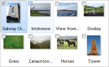
false. The following image shows three state check boxes with the last items with check box disabled:
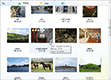
Check boxes are supported in every view. For example, here are the check boxes enabled in Thumbnails view:
Check Box Appearance
It is possible to customize check box appearance on each item using BetterListViewItem.CheckBoxAppearance property. It can have on of three values:
-
Hide
-
Check box is not displayed on the item.
-
-
CheckBox
-
Default appearance.
-
-
RadioButton
-
Check box appears as radio button.
-
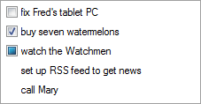
Note that RadioButton appearance supports only two states. When three-state check boxes are used, the radio button-like check boxes will show only the two.
The following image shows how custom check box appearance can be used. Check boxes on parent items are hidden while the child items display radio buttons:
Check Box Alignment
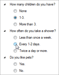
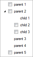
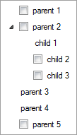
When check boxes are turned on, every item label is aligned such that there is enough space for a check box even when the check box is hidden on that item. This is a default appearance and can be adjusted by setting CheckBoxesAlign property to false. The following images show the default appearance (left) and adjusted appearance when CheckBoxesAlign property is set to false (right). The "parent 3" and "parent 4" items look on the left image like children of "parent 2" item, which is not the case. Removing the unnecessary offset clarifies their position:
Sample Source Code
C#
this.listView.BeginUpdate();

this.listView.Items.AddRange(
    new[]
    {
        "unchecked by default",
        "checked by default",
        "indeterminate by default",
        "check box disabled"
    });

// set the first item unchecked
this.listView.Items[0].CheckState = CheckState.Unchecked;
// set the second item checked
this.listView.Items[1].CheckState = CheckState.Checked;
// set the third item in indeterminate state
this.listView.Items[2].CheckState = CheckState.Indeterminate;
// disable check box on the fourth item
this.listView.Items[3].CheckBoxAppearance = BetterListViewCheckBoxAppearance.Hide;

// enable three-state check boxes (the same property can be used for disabling them or settings two-state ones)
this.listView.CheckBoxes = BetterListViewCheckBoxes.ThreeState;
// check boxes are supported in all views, so we can set for example the 'List' view
this.listView.View = BetterListViewView.List;

this.listView.EndUpdate();
Visual Basic
ListView.BeginUpdate()

ListView.Items.AddRange(
    New String() {
                     "unchecked by default",
                     "checked by default",
                     "indeterminate by default",
                     "check box disabled"
                 })

' set the first item unchecked
ListView.Items (0).CheckState = CheckState.Unchecked
' set the second item checked
ListView.Items (1).CheckState = CheckState.Checked
' set the third item in indeterminate state
ListView.Items (2).CheckState = CheckState.Indeterminate
' disable check box on the fourth item
ListView.Items (3).CheckBoxAppearance = BetterListViewCheckBoxAppearance.Hide

' enable three-state check boxes (the same property can be used for disabling them or settings two-state ones)
ListView.CheckBoxes = BetterListViewCheckBoxes.ThreeState
' check boxes are supported in all views, so we can set for example the 'List' view
ListView.View = BetterListViewView.List

ListView.EndUpdate()| « Background Image | Index | Collections » |
| Better Thumbnail Browser Documentation | Copyright © 2010-2012 ComponentOwl.com |