| « Label Editing | Index | Multi-line Items » |
Layout Properties
Better ListView consists of three visual parts: column headers, items (sub-items) and groups. Each of these has its corresponding BetterListViewLayout instance that defines how to measure and position elements in these parts. Furthermore, every view has its layout, because it behaves differently, can contain images of different size, etc. The layout instances can be accessed through these properties:
-
LayoutColumns
-
LayoutGroupsCurrent (depends on current view)
-
LayoutItemsCurrent (depends on current view)
There are also properties for specific views, so you can address layout properties of other than current view:
-
LayoutGroupsHorizontal
-
LayoutGroupsVertical
-
LayoutItemsDetails (used when columns are not present in Details view)
-
LayoutItemsDetailsColumns
-
LayoutItemsLargeIcon
-
LayoutItemsList
-
LayoutItemsSmallIcon
-
LayoutItemsThumbnails
-
LayoutItemsTile
All the layout properties properties always reference the same instance of BetterListViewLayout except for LayoutGroupsCurrent and LayoutItemsCurrent which depend on current view. There are also two layouts for Details view. This is because Better ListView uses different layout for items in Details view with and without columns (regular .NET ListView supports Details view, but only when columns are visible).
These layout contain properties defining sizes and paddings of all the elements and element parts. These properties are descibed below in their contexts.
Custom Item Height
Item height can be customized with BetterListViewItem.CustomHeight property. The default value is 0, which means that the custom height if effectively not used.
Every item has some minimum height determined by its font, image and number of text lines. The CustomHeight value will take effect whenever it is larger than the minimum height.
The following image shows items with different heights:
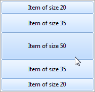
The property works for Details view only.
Text Layout
The only common property for all layouts is TextPadding, which is the spacing around text area.
There is no property for settings text size, because it depends on text in each element. There is, however, some control over text height. It is different for column header, group, and item layout.
Column header and group layouts share a property called MinimumTextHeight. This is a minimum allowed height of the text area. When the actual text height is smaller than this value, the text area will have MinimumTextHeight pixels in vertical dimension and the text will be centered vertically in it.
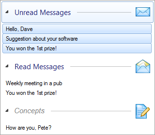
Column header and item layouts have an extra property called MaximumTextLines which allows displaying multi-line text. When its value is greater than 1, the text is first broken into multiple lines up to the specified value. Text trimming is used when there is no remaining lines left:
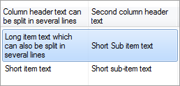
In this example, MaximumTextLines property was set to 3 for both column headers and items:
C#
listView.LayoutColumnHeaders.MaximumTextLines = listView.LayoutItemsCurrent.MaximumTextLines = 3;Visual Basic
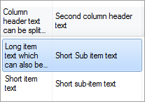
ListView.LayoutColumnHeaders.MaximumTextLines = ListView.LayoutItemsCurrent.MaximumTextLines = 3When the column width is too small to maintain given text, even then the text is trimmed:
Maximum allowed number of text lines can also be specified on each sub-item individually by setting BetterListViewSubItem.MaximumTextLines.
Default Image Alignment
Every view defined default image alignment. For example, image in Details view is usually aligned on the left side of text. You can set the DefaultImageAlignmentHorizontal and DefaultImageAlignmentVertical properties of the item layout. Group and column header layout also support these properties.
For example, setting LayoutGroupsCurrent.DefaultImageAlignmentHoriozontal to BetterListViewImageAlignmentHorizontal.AfterTextCenter results in the following image alignment on all the groups:
It is possible to change image alignment on every item, sub-item, column header and group separately.
Default Text Alignment and Trimming
Every view defines default text alignment and trimming. For example, text in Details view is usually aligned on left, while in LargeIcon view is centered. You can set the DefaultTextAlignmentHorizontal, DefaultTextAlignmentVertical and DefaultTextTrimming properties of the item layout.
These properties are used on item when the item has AlignHorizontal property set to TextAlignmentHorizontal.Default, AlignVertical property to TextAlignmentVertical.Default and TextTrimming property to TextTrimming.Undefined.
Text alignment and trimming can be set on each element individually (see Text Formatting).
Image Layout
Better ListView can display images of arbitrary sizes (not only predefined ones) in all views and always keeps aspect ratios of the images.
Images are downscaled, if needed, but never upscaled (they are rather centered in the larger bounding box).
Image layout options affect a bounding box, in which images are aligned. It is also possible to set up image paddings and borders of different styles and sizes.
Image layout can be adjusted on all Better ListView layouts through the corresponding properties described below.
Image Size
Column and group layouts contain ImageSize property to manually adjust area for placing images.
Item layouts contain also SubImageSizes property which is array of BetterListViewImageSize objects. The collection should contain at leat one BetterListViewImageSize instance (returned by ImageSize property). When the collection contains more tnat one entry, item and sub-items can have different image area sizes.
The BetterListViewImageSize instance holds minimum and maximum allowed image size for the corresponding item/sub-item. Better ListView will always fit images within these boundaries.
You can set specific image size for some layout:
C#
listView.LayoutItemsLargeIcon.ImageSizes = new[] { new BetterListViewImageSize(new Size(97, 34)) };Visual Basic
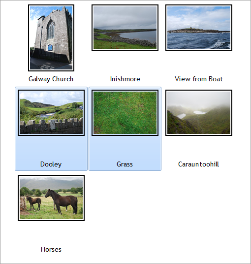
ListView.LayoutItemsLargeIcon.ImageSizes = New BetterListViewImageSizeSize() {New BetterListViewImageSizeSize(New Size(97, 34))}We set bounding box for images in the LargeIcon view.
The following images show how Better ListView fits larger images into such bounding box (displayed in gray):


Smaller images are just centered:


Minimum Text Size
It is possible to customize minimum text area size.
Every item has text area size determined by minimum size and actual text size. The minimum size is cointrolled by BetterListViewLayout.EmptyTextSize property. We can set EmptyTextSize to desired minimal size of text:
C#
listView.LayoutItemsCurrent.AutoSizeText = true;
listView.LayoutItemsCurrent.EmptyTextSize = new Size(8, 8);
Visual Basic
listView.LayoutItemsCurrent.AutoSizeText = False
listView.LayoutItemsCurrent.EmptyTextSize = New Size(8, 8)
The sample code sets EmptyTextSize to (8,8). This is the minimum allowed text area size.
The following image shows automatic sizing of the text when minimum text size is set to small value, so that child items (with smaller font) are allowed to be smaller:
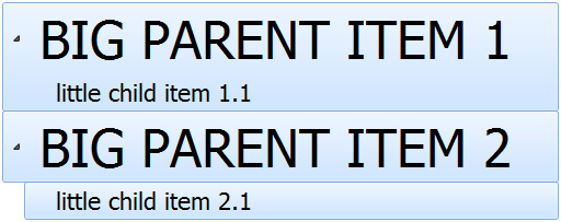
Image Border
Image is an element part and as such it has some padding around it. This is just empty space around the image to keep it in distance from other elements. This padding can be adjusted via BetterListViewLayoutItems.ImagePadding property of the corresponding layout.
There are also two other properties available in item layouts, which allows setting painted frame around the image. These are:
-
ImageBorderColor
-
ImageBorderType
-
ImageBorderThickness (in pixels)
For example, setting:
C#
listView.LayoutItemsCurrent.ImageBorderType = ImageBorderType.SingleOffset;
listView.LayoutItemsCurrent.ImageBorderThickness = 2;
Visual Basic
ListView.LayoutItemsCurrent.ImageBorderType = ImageBorderType.SingleOffset
ListView.LayoutItemsCurrent.ImageBorderThickness = 2
Yields this kind of image border:
Column Headers Properties
These properties are specific to column headers layout:
-
BetterListViewLayoutColumnHeaders.BorderSize
-
BetterListViewLayoutColumnHeaders.SortGlyphPadding
BorderSize defines extent of boundary at the right end of each column header. When mouse cursor hovers over this boundary, the column header can be resized.
SortGlyphPadding is the spacing around sort glyph, which is displayed when the column header is sorted. It is displayed as an arrow pointing upwards or downwards (dependind on sort order). When visual style can be used, this glyph is located in the top part of column header. It is located in the right part, otherwise.
Group Properties
There is only one property specific to group layout, which is BetterListViewLayoutGroups.MinimumSize. This is a minimum allowed size of a group. For vertically oriented groups, only height dimension is taken into account.
Layout of vertically oriented groups supports also BetterListViewLayoutGroupsVertical.ExpandButtonPadding property. This is a spacing around group expand button.
Common Properties
All the layouts share following properties:
-
BetterListViewLayout.ElementInnerPadding
-
BetterListViewLayout.ElementOuterPadding
-
BetterListViewLayout.LayoutPadding
Each element has inner padding specified by ElementInnerPadding, which is a distance between element boundary and its content. These is also outer padding specified by ElementOuterPadding, which is a distance between elements.
Whole layout has also a padding specified by LayoutPadding. This is a distance between elements and its containing area (control or group).
Following image shows different areas with and without paddings:
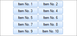
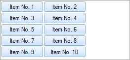
Centering Items in LargeIcon and Thumbnails View
Earch row of items in LargeIcon and Thumbnails view can be aligned either to the left or to center of the client area. This can be done using Center property of the corresponding layout (LayoutItemsLargeIcon.Center or LayoutItemsThumbnails.Center). The following images show how items are aligned when the Center property is set to true and false:
Sample Source Code
The following sample shows setting up Better ListView to display multi-line items in Details view stretched to width of a client area (because there are no columns added):
C#
this.listView.BeginUpdate();

this.listView.Items.AddRange(
    new[]
    {
        "Item label can be split in several lines defined by MaximumTextLines property of layout class corresponding to current View.",
        "All text trimming methods also works with multi-line items. When some items cannot be split to more lines, trimming with additional ellipsis can be used."
    });

// resize items in Details view with content to show how the text breaks
// other way would be to add column and see text breaking when resizing the column
this.listView.AutoSizeItemsInDetailsView = true;

// enable multi-line items by settings maximum allowed text lines to a number larger than 1
this.listView.LayoutItemsDetails.MaximumTextLines = 4; //NOTE: we can also use LayoutItemsCurrent for the view currently set

this.listView.EndUpdate();
Visual Basic
ListView.Items.AddRange (
    New String() { _
                     "Item label can be split in several lines defined by MaximumTextLines property of layout class corresponding to current View.",
                     "All text trimming methods also works with multi-line items. When some items cannot be split to more lines, trimming with additional ellipsis can be used."
                 })

' resize items in Details view with content to show how the text breaks
' other way would be to add column and see text breaking when resizing the column
ListView.AutoSizeItemsInDetailsView = True

' enable multi-line items by settings maximum allowed text lines to a number larger than 1
ListView.LayoutItemsDetails.MaximumTextLines = 4
'NOTE: we can also use LayoutItemsCurrent for the view currently set
ListView.EndUpdate()| « Label Editing | Index | Multi-line Items » |
| Better ListView Documentation | Copyright © 2010-2012 ComponentOwl.com |