| « Tooltips | Index |
Views
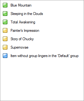
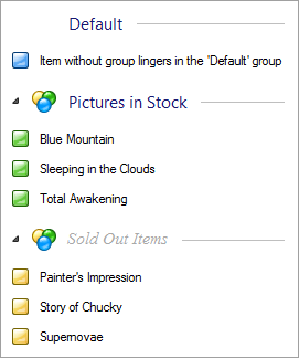
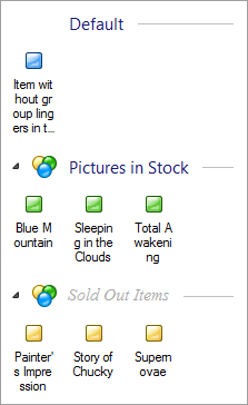
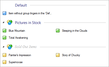
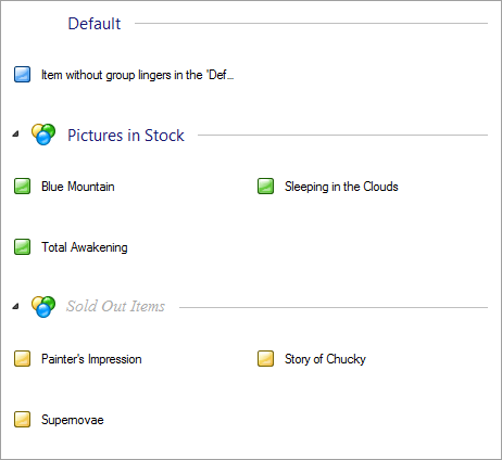
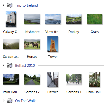
Better ListView can be display items in multiple ways called views. The view can be set using View property. Following sections will present views supported by Better ListView. All views suppport Groups, as displayed in the screenshots.
Each of the view supports arbitrary image sizes and other settings (see Layout Properties for more information).
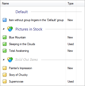
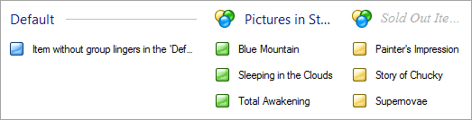
Details view
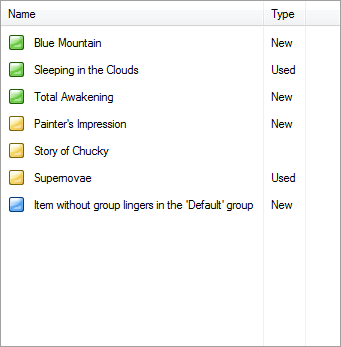
This is the default view. .NET ListView displays items in detailed view only when there are some columns present as well. Better ListView, however, can display items in Details view even without columns:
When columns are added into the view, items can display their sub-items as well:
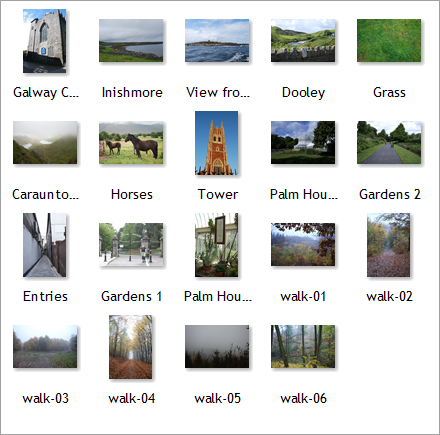
LargeIcon View
The LargeIcon view displays items with "large" icons (usually 32 by 32 pixels, but Better ListView supports any image size). Item text can be wrapped to up to four lines by default and the horizontal spacing between items is varied so that the items evenly fill client area:
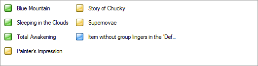
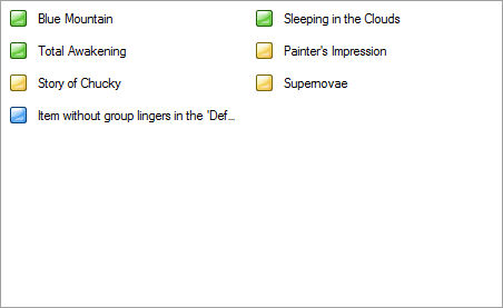
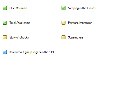
List View
The List view is different from other views because it displays items vertically oriented. Instead of items flowing in left-right top-dop fashion, they are arranged in columns, The groups in the List view has to be oriented horizontally:
SmallIcon View
The SmallIcon view displays items with "small" icons (usually 16 by 16 pixels, but Better ListView supports any image size). Contrary to LargeIcon view, item text is placed to the right of item images:
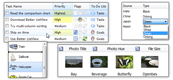
Tile View
The Tile view displays items as "tiles", whose size can be adjusted by TileSize property. Tile view can display sub-item texts on additional lines, but only item image (possible images of sub-items are hidden):
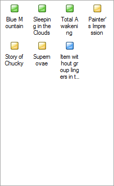
Thumbnails View
The Thubnails view is similar to LargeIcon view. Items are of the same height, there is a single-line text by default and the items are centered with fixed spacing between them:
Detecting view change
When the value of View property has changed, a BetterListViewViewChanged event is raised. Event data or the event contains old a new value of type BetterListViewView.
| « Tooltips | Index |
| Better ListView Express Documentation | Copyright © ComponentOwl.com |